
The Napalm Brothers: REVIEW
Another day and another Totally Biased Comic Book review!

Today I will be reviewing "The Napalm Brothers" by Six Combat Scale! Sorry I do not know his real name, and the book did not have a credits page that I could find, so I will have to use his Twitter handle.
I backed The Napalm Brothers on IndieGoGo where I got a printed version of the book, and a no-drm PDF copy for just 10$, and that included shipping! I thought for such a reasonable price, and knowing that the book was already finished and would ship very soon, that I did not have much to lose taking a risk and backing the project. This IndideGoGo raised just over 1800$ on 131 individual backers.
I really liked and totally respect this business model and hope to see more creators going the route of offering a book that they have at least completed the artwork, coloring, lettering and such and have the book ready to go to the printers. It is better for all involved and I believe brings about more trust from the customers for the projects. I backed this book on March 24th and got it by April 11th! Unfortunately I do not remember how long the project had been going but it did feel like it was fulfilled not long after it's launch and that is a major plus compared to most campaigns I back.
I follow the creator Six Combat Scale on Twitter and the guy who shipped it out for him Dug Garrett. I do not really know the former creator well but interact with the later pretty often on Twitter. Both seem like pretty decent guys online and rarely seem to be too involved with the infighting that constantly goes on online, but recently there was some big dust up between them and another personality I know nothing about on some drama I also know nothing about and didn't care enough to look into or follow. But for the most part they seem like very reasonable creators to follow.

The book arrived in good condition and was packaged nicely in its own Gemini mailer and it was also bagged and boarded. It was nice to see they didn't skimp much on the shipping costs especially considering that they didn't charge any extra on top of the 10$ price of the base book for extra shipping. That was a very pro consumer move in my opinion.
The print quality was quite nice and the colors and pages seemed a decent quality and I didn't have any real concerns about any of those issues. There was some light creasing on three pages near the end of the book. I asked people online if they also had this issue and no one besides myself did. The crease was really just noticeable in one of the pages and didn't offend me at all. I think it was just a rare fluke. After I asked people on My Timeline if they had any issues both the creator and the shipper of the book got involved and volunteered to replace the book and even offered me a sketch for my troubles. I thanked both of them and declined but I did appreciate the gesture. Such interactions should be a good sign for any consumer who thinks about backing either creator.

Once again though this was one of those crowd funded Indie comics that come with the thick "board" cover and I personally do not like those for the smaller "floppy" comics. I feel that they are too thick for the small amount of pages (24 for this issue) and I would prefer a regular and standard "paper" cover for such books, but I might be in the minority here because that is just a personal preference.
Now on to the art, coloring, lettering, writing and over all value of the comic book...
The PDF copy of the book came a couple of days before the printed version so I looked over it first and I must admit that I wasn't a big fan of the art or the style at first glance. The quality of the art work struck me as a bit more on the amateur and free web comic side of things. It wasn't offensively bad or anything but did not live up to the standard most would probably expect from a professionally printed publication.

But when I got the printed version in the mail I found that I liked the artwork more for some unknown reason and it didn't bother me as much as it did digitally.

That said, in my opinion, my original thoughts on the artwork still stand. While the artist did often show promise on a few pages overall, he had a few noticeable short comings. He seems to have some issues with perspective and anatomy. Also, at times, his line work looks too thick, and especially in the PDF version, this line work almost gave the appearance that some of the characters looked pasted on top of the other art work.
The coloring seemed to have an intentional late 60's early 70's vibe to it. But a lot of it was over busy and distracted from the art work and the flow of the story. The same distraction can also be applied to the lettering as well. As I have pointed out elsewhere good lettering to a comic book should never take you out of the story and should not be noticeable other than just being able to read the text.


Ofttimes, mostly when showing the villains or in the narrator text, the fonts became hard to read and really took time to have to focus on and to make out the text because of extra, unneeded colors or strange fonts. Also (and this might just be personal taste again) sound effects in comics should always be drawn into the work and not added with illustrator IMO. ;)

All that said I do not just have negative thoughts about the art in this book. The artist often showed some great potential (like in the panel above) and I can see great success from him in the future if he continues to grow his craft.
Now to the story and my thoughts on it, and I will try to have as few BIG spoilers here as possible.

The writing and the story had that typical late 70's/early 80's feel to it that you often seen in action movies from that era. There was nothing too original or groundbreaking to the formula. It seemed to have a real Rambo meets exploitation style movies to it, mixed with a slight Terrentino vibe as well.
The scripting and the dialog was pretty good for the most part but I did have a few problems with the plot and with how the story unfolded.
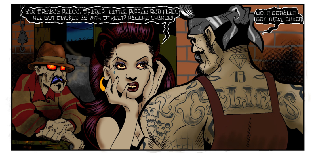
The writer did not do a great job laying out or properly hinting at the motives or the nature of the enemies in the tale. I am still not sure if the "gang members" attacking the heroes in the book are entirely human or not. While there is no story hint that they are any more than human beings there are artistic hints that they may be more than they appear. But it is hard to tell by the art alone if these are plot hints or just a stylistic choice for the artwork. The bad guys appear to have glowing eyes and the speech balloons when they talk are patterned in a way that makes me wonder if they are supposed to be supernatural in some unexplained way.
It is fine to leave some mystery to be reveled later in another issue or time, like the villains having some origin that is zombie, demonic or drug related in relation of the character "Corneal Kreiger", but a good writer should leave at least one or two hints. If it were not for the visual style of the eyes and speech patterns of the gang members I would not even be considering this question, but that is not enough to go on. I may very well be looking too much into what was just a style choice by the artist but I will not know and cannot afford a proper guess until the second issue if and when it comes out.
Also there is the writing crime of the books biggest revel- the monkey! Pardon me, gorilla. As you could probably see from the art shown in this review and from the preview art of the campaign itself, there is a large gorilla in the story as well. The problem with this is the sudden and unhinted at reveal of the creature.

The two main characters steal a van, drive an unspecified but presumably long distance in said van and attend a funeral for a friend in said van, and then get into a large street gunfight and flee in the van only to find the appearance of a MASSIVE gorilla that they had no knowledge of before hand.
The problem with this is we as the reader are supposed to buy that these two men could steal a van, with an unnoticed gorilla in it, and drive with it still unnoticed a long distance and still be surprised at its unlikely emergence. This was just disappointing and bad writing that could have been fixed pretty easily if the creator had just did a small bit of foreshadowing. At the very least, while driving, the two main characters should have said something about noticing strange smells or hearing strange unexplained sounds but they do not. Instead a MAGIC GORILLA just shows up. LOL. This little issue is just made more obvious by an earlier panel while they were driving and lets the reader see from the front windshield all the way through the back windshield and there is no hint of a giant beast anywhere to be seen. Again, not really a big problem, and it is barely worth mentioning other than to transition this review into talking about the ash-can comic that came with the book for free.

The "free" ash-can was unlocked for backers at the 1500$ mark on the IndieGoGo and was just another example of how good a deal this campaign was for the consumer from a dollar viewpoint.
This perk was a "true ashcan" which means it was a smaller format/size of the book in black and white. And it was a nice addition to the story and campaign. I cannot explain why exactly (but it probably had something to do with the smaller size and lack of coloring) but the art looked much nicer and crisper in the ash can in both of the stories that it contained. Also both stories seemed to be better told and were more enjoyable than most of the main comic book.
The first story was written and drawn by the main book's artist Six Combat Scale and was a neat little origin story of one of the characters named Duane. It was well done and was a shame it wasn't worked into the main book instead of as an add on. The second story was written by the same artist but had artwork by a different artist I am unfamiliar with named Tony Sizzle and told the origin story of how the Gorilla came into the story. The art for this short story was very good and very professional looking, but even though it was nice to have some relative background to shed some light on the unlikely appearance of the gorilla it didn't really do a good job explaining why he is so docile at his capture or why he is so friendly to the strangers that stole the van. While there is a quick amusing reference to the monkey enjoying smoking pot, the pot revelation comes only after the two hippies stole him from the zoo with no resistance from the gorilla or noticeable threat to their personal safety. But perhaps I am thinking too much into what is just supposed to be a fun, little comic book story.
And that is what The Napalm Brothers was in the long run, a fun and action packed little comic book story so please don't take this review more negatively that it was intended to be. Sometimes I am bad to nitpick. The book was pretty great for what it actually was, a first time offer from an amateur artist at a fair price point.
Sometimes I look at certain crowd funded books being offered (especially from the comics gate side of the business) and shake my head at the nerve of some of the comic book artists who are as bad and amateur as I am, and who offer these books as a finished and professional product. I think it is delusional on the creator's part compared to their skill level and bad for the movement as a whole creating the perception that indie crowd funded comics are made just by a bunch of rank amateurs.
I always make a point to call such pseudo professionals out for charging money for products that are on the level of free web comics and presenting them as quality work. But The Napalm Brothers does not fall into that category for at least two reasons.
The first is this book is actually much higher quality than the books I am referring too and also the fair price point helps in recommending it over some of those other books.
The main reason I am offended by some of these crowd funds for books that are clearly the work of amateurs is because they have the gall to charge premium 25$+ prices for such trash. Not only is The Napalm Brothers light years better in quality than many of these books but it was priced fairly and realistically in comparison to those campaigns and to the page count and experience of the creators.
The Napalm Brothers was an interesting and cool product to come from a first time creator like Six Combat Scale. It lays the groundwork and consumer trust for a new creator to get his foot in the door and hopefully learn and improve his craft for his next campaign. I will be interested and be waiting to see it and back this book a second time to see where it goes, if for no other reason than to support the business model of backing finished books at fair price points.

Today I will be reviewing "The Napalm Brothers" by Six Combat Scale! Sorry I do not know his real name, and the book did not have a credits page that I could find, so I will have to use his Twitter handle.
I backed The Napalm Brothers on IndieGoGo where I got a printed version of the book, and a no-drm PDF copy for just 10$, and that included shipping! I thought for such a reasonable price, and knowing that the book was already finished and would ship very soon, that I did not have much to lose taking a risk and backing the project. This IndideGoGo raised just over 1800$ on 131 individual backers.
I really liked and totally respect this business model and hope to see more creators going the route of offering a book that they have at least completed the artwork, coloring, lettering and such and have the book ready to go to the printers. It is better for all involved and I believe brings about more trust from the customers for the projects. I backed this book on March 24th and got it by April 11th! Unfortunately I do not remember how long the project had been going but it did feel like it was fulfilled not long after it's launch and that is a major plus compared to most campaigns I back.
I follow the creator Six Combat Scale on Twitter and the guy who shipped it out for him Dug Garrett. I do not really know the former creator well but interact with the later pretty often on Twitter. Both seem like pretty decent guys online and rarely seem to be too involved with the infighting that constantly goes on online, but recently there was some big dust up between them and another personality I know nothing about on some drama I also know nothing about and didn't care enough to look into or follow. But for the most part they seem like very reasonable creators to follow.

The book arrived in good condition and was packaged nicely in its own Gemini mailer and it was also bagged and boarded. It was nice to see they didn't skimp much on the shipping costs especially considering that they didn't charge any extra on top of the 10$ price of the base book for extra shipping. That was a very pro consumer move in my opinion.
The print quality was quite nice and the colors and pages seemed a decent quality and I didn't have any real concerns about any of those issues. There was some light creasing on three pages near the end of the book. I asked people online if they also had this issue and no one besides myself did. The crease was really just noticeable in one of the pages and didn't offend me at all. I think it was just a rare fluke. After I asked people on My Timeline if they had any issues both the creator and the shipper of the book got involved and volunteered to replace the book and even offered me a sketch for my troubles. I thanked both of them and declined but I did appreciate the gesture. Such interactions should be a good sign for any consumer who thinks about backing either creator.

Once again though this was one of those crowd funded Indie comics that come with the thick "board" cover and I personally do not like those for the smaller "floppy" comics. I feel that they are too thick for the small amount of pages (24 for this issue) and I would prefer a regular and standard "paper" cover for such books, but I might be in the minority here because that is just a personal preference.
Now on to the art, coloring, lettering, writing and over all value of the comic book...
The PDF copy of the book came a couple of days before the printed version so I looked over it first and I must admit that I wasn't a big fan of the art or the style at first glance. The quality of the art work struck me as a bit more on the amateur and free web comic side of things. It wasn't offensively bad or anything but did not live up to the standard most would probably expect from a professionally printed publication.

But when I got the printed version in the mail I found that I liked the artwork more for some unknown reason and it didn't bother me as much as it did digitally.
That said, in my opinion, my original thoughts on the artwork still stand. While the artist did often show promise on a few pages overall, he had a few noticeable short comings. He seems to have some issues with perspective and anatomy. Also, at times, his line work looks too thick, and especially in the PDF version, this line work almost gave the appearance that some of the characters looked pasted on top of the other art work.
The coloring seemed to have an intentional late 60's early 70's vibe to it. But a lot of it was over busy and distracted from the art work and the flow of the story. The same distraction can also be applied to the lettering as well. As I have pointed out elsewhere good lettering to a comic book should never take you out of the story and should not be noticeable other than just being able to read the text.

Ofttimes, mostly when showing the villains or in the narrator text, the fonts became hard to read and really took time to have to focus on and to make out the text because of extra, unneeded colors or strange fonts. Also (and this might just be personal taste again) sound effects in comics should always be drawn into the work and not added with illustrator IMO. ;)

All that said I do not just have negative thoughts about the art in this book. The artist often showed some great potential (like in the panel above) and I can see great success from him in the future if he continues to grow his craft.
Now to the story and my thoughts on it, and I will try to have as few BIG spoilers here as possible.

The writing and the story had that typical late 70's/early 80's feel to it that you often seen in action movies from that era. There was nothing too original or groundbreaking to the formula. It seemed to have a real Rambo meets exploitation style movies to it, mixed with a slight Terrentino vibe as well.
The scripting and the dialog was pretty good for the most part but I did have a few problems with the plot and with how the story unfolded.
The writer did not do a great job laying out or properly hinting at the motives or the nature of the enemies in the tale. I am still not sure if the "gang members" attacking the heroes in the book are entirely human or not. While there is no story hint that they are any more than human beings there are artistic hints that they may be more than they appear. But it is hard to tell by the art alone if these are plot hints or just a stylistic choice for the artwork. The bad guys appear to have glowing eyes and the speech balloons when they talk are patterned in a way that makes me wonder if they are supposed to be supernatural in some unexplained way.
It is fine to leave some mystery to be reveled later in another issue or time, like the villains having some origin that is zombie, demonic or drug related in relation of the character "Corneal Kreiger", but a good writer should leave at least one or two hints. If it were not for the visual style of the eyes and speech patterns of the gang members I would not even be considering this question, but that is not enough to go on. I may very well be looking too much into what was just a style choice by the artist but I will not know and cannot afford a proper guess until the second issue if and when it comes out.
Also there is the writing crime of the books biggest revel- the monkey! Pardon me, gorilla. As you could probably see from the art shown in this review and from the preview art of the campaign itself, there is a large gorilla in the story as well. The problem with this is the sudden and unhinted at reveal of the creature.

The two main characters steal a van, drive an unspecified but presumably long distance in said van and attend a funeral for a friend in said van, and then get into a large street gunfight and flee in the van only to find the appearance of a MASSIVE gorilla that they had no knowledge of before hand.
The problem with this is we as the reader are supposed to buy that these two men could steal a van, with an unnoticed gorilla in it, and drive with it still unnoticed a long distance and still be surprised at its unlikely emergence. This was just disappointing and bad writing that could have been fixed pretty easily if the creator had just did a small bit of foreshadowing. At the very least, while driving, the two main characters should have said something about noticing strange smells or hearing strange unexplained sounds but they do not. Instead a MAGIC GORILLA just shows up. LOL. This little issue is just made more obvious by an earlier panel while they were driving and lets the reader see from the front windshield all the way through the back windshield and there is no hint of a giant beast anywhere to be seen. Again, not really a big problem, and it is barely worth mentioning other than to transition this review into talking about the ash-can comic that came with the book for free.

The "free" ash-can was unlocked for backers at the 1500$ mark on the IndieGoGo and was just another example of how good a deal this campaign was for the consumer from a dollar viewpoint.
This perk was a "true ashcan" which means it was a smaller format/size of the book in black and white. And it was a nice addition to the story and campaign. I cannot explain why exactly (but it probably had something to do with the smaller size and lack of coloring) but the art looked much nicer and crisper in the ash can in both of the stories that it contained. Also both stories seemed to be better told and were more enjoyable than most of the main comic book.
The first story was written and drawn by the main book's artist Six Combat Scale and was a neat little origin story of one of the characters named Duane. It was well done and was a shame it wasn't worked into the main book instead of as an add on. The second story was written by the same artist but had artwork by a different artist I am unfamiliar with named Tony Sizzle and told the origin story of how the Gorilla came into the story. The art for this short story was very good and very professional looking, but even though it was nice to have some relative background to shed some light on the unlikely appearance of the gorilla it didn't really do a good job explaining why he is so docile at his capture or why he is so friendly to the strangers that stole the van. While there is a quick amusing reference to the monkey enjoying smoking pot, the pot revelation comes only after the two hippies stole him from the zoo with no resistance from the gorilla or noticeable threat to their personal safety. But perhaps I am thinking too much into what is just supposed to be a fun, little comic book story.
And that is what The Napalm Brothers was in the long run, a fun and action packed little comic book story so please don't take this review more negatively that it was intended to be. Sometimes I am bad to nitpick. The book was pretty great for what it actually was, a first time offer from an amateur artist at a fair price point.
Sometimes I look at certain crowd funded books being offered (especially from the comics gate side of the business) and shake my head at the nerve of some of the comic book artists who are as bad and amateur as I am, and who offer these books as a finished and professional product. I think it is delusional on the creator's part compared to their skill level and bad for the movement as a whole creating the perception that indie crowd funded comics are made just by a bunch of rank amateurs.
I always make a point to call such pseudo professionals out for charging money for products that are on the level of free web comics and presenting them as quality work. But The Napalm Brothers does not fall into that category for at least two reasons.
The first is this book is actually much higher quality than the books I am referring too and also the fair price point helps in recommending it over some of those other books.
The main reason I am offended by some of these crowd funds for books that are clearly the work of amateurs is because they have the gall to charge premium 25$+ prices for such trash. Not only is The Napalm Brothers light years better in quality than many of these books but it was priced fairly and realistically in comparison to those campaigns and to the page count and experience of the creators.
The Napalm Brothers was an interesting and cool product to come from a first time creator like Six Combat Scale. It lays the groundwork and consumer trust for a new creator to get his foot in the door and hopefully learn and improve his craft for his next campaign. I will be interested and be waiting to see it and back this book a second time to see where it goes, if for no other reason than to support the business model of backing finished books at fair price points.


Comments
Post a Comment